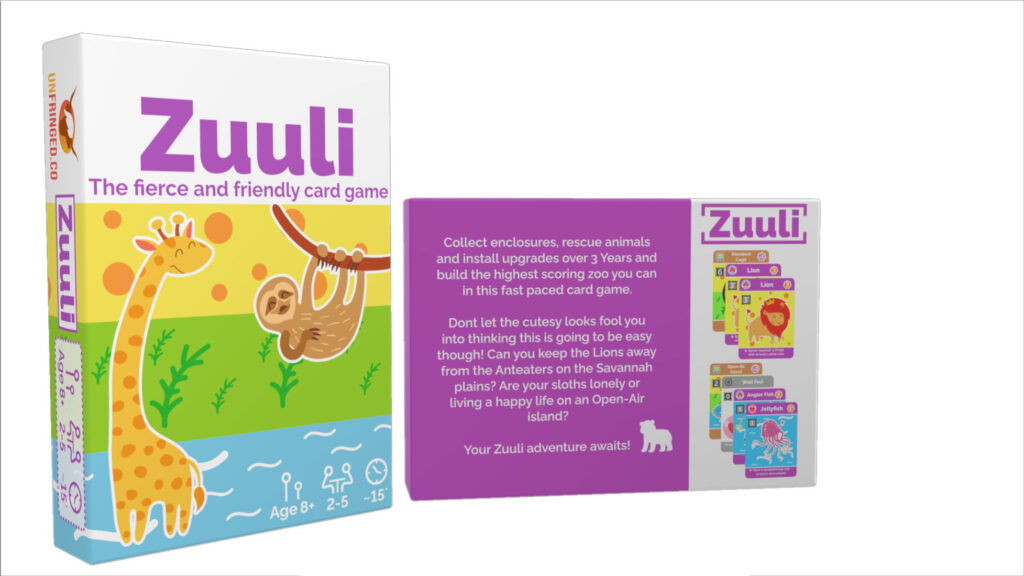
After making the decision to upgrade the final version of Zuuli to a 2 Piece Hard box instead of a tuck box we had to also decide whether and how to upgrade the artwork.
Personally I really liked the artwork on the tuckbox. The wrapped around colours with the white collar, jellyfish tab and hidden tortoise and hummingbird on the tabs really worked for me. My first thought was to try and apply the same design to the much larger box but something just felt off. The jellyfish no longer worked on the top opening and the larger block colours that worked for me on the smaller box started to feel a bit too simplistic and amateur.
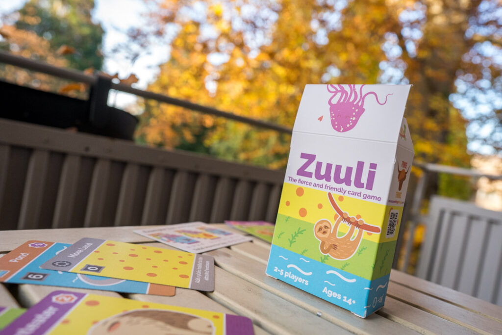
After playtesting I had a lot of positive feedback about the white standard cardback so I knocked together a version of this, printed it out and stuck it onto our box of ‘Virus!’ which just so happens to be the exact box dimensions of the new 2 piece box. I liked it. I didn’t love it but it worked better than the blocky version.
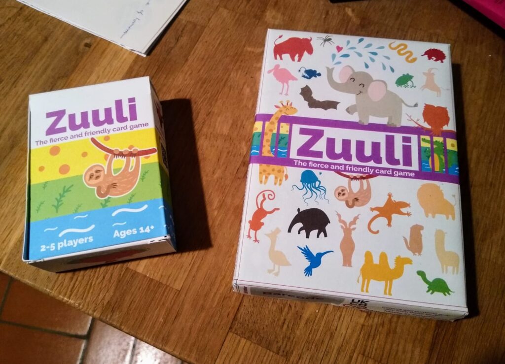
This sat on my desk for a couple of months and slowly my like turned into more of a meh. To this day I’m not quite sure what it is that turned me off about it but I decided it needed at least one more attempt to bring back that love rather than a mediocre like. I will say that one appeal that remains with this design is how much it stands out on a shelf by being mostly white amongst more colourful boxes. It made me wonder whether there’s a reason other designers stay away from it as a primary design colour. Tokaido is a fantastic example where it truly stands out beautifully but maybe there’s something in the manufacturing process where white is hard to reproduce or recommended against? If you have any ideas let me know in the comments.
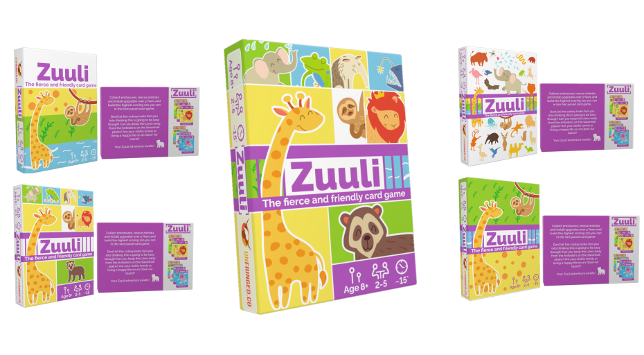
But back to the design problem. I knocked together a few more designs and decided to send them out to friends, playtesters and family and had an overwhelming preference for the design you can see on the main Zuuli page today.
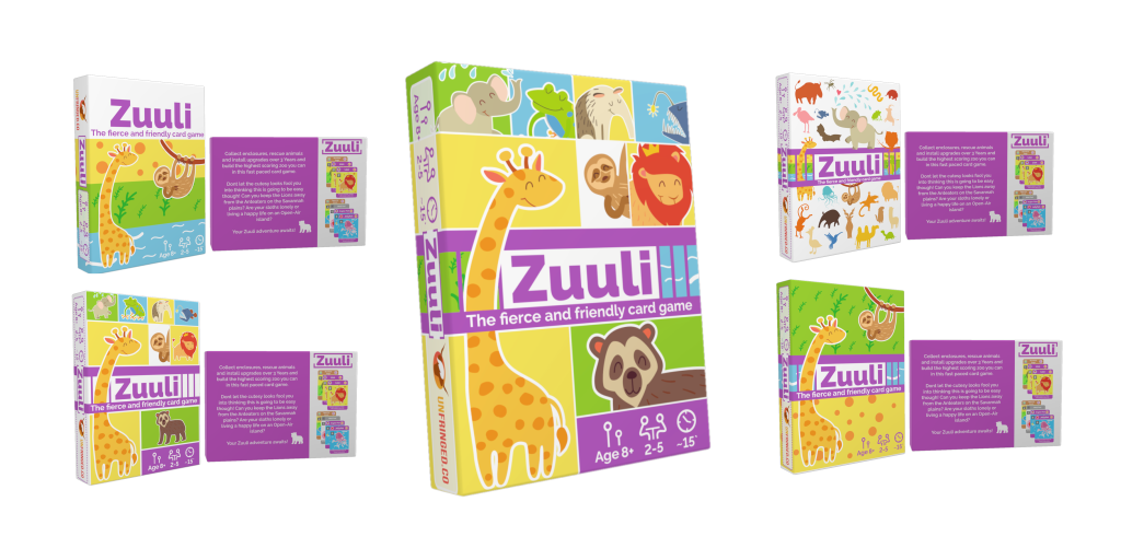
And to this day I also love it (long may that last). Maybe I’m just a sucker for bright colours and cute animals but I can’t wait to see this final design on our commercial copies of Zuuli.